I have a lot of fountain pens - seven of them. One big reason for this is that you can fill them with any colour of ink imaginable, and I like to use a few colours at once. Rotating through colours in lecture notes helps me find things when skimming through them later, and using lots of colours while journaling is just fun. I like planning ahead and picking inks that will look good together. Colour theory is my favourite part of visual arts too.
But, since I like combinations so much, it bothered me that my pens themselves didn’t look good together. What was I thinking, having all these pens with designs that looked ugly and mismatched side by side? And having duplicates of the same pen? Not satisfying at all!
Here they are, plus my two ballpoint pens1:
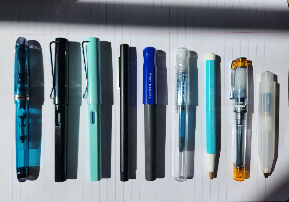
It’s not relevant, but from left to right: Pilot Custom 74, Lamy Safari Black, Lamy Safari Blue Macaron, Lamy CP1, Pilot Kakuno Blue/Grey, Pilot Kakuno Clear, Leuchtturm Drehgriffel Nr.1 Aquamarine, Pilot Prera Orange, Kaweco Frosted Sport Ballpoint Natural Coconut.
I’ve been getting back into pretty stationery recently, so I thought for a while about sorting this problem out: selling some of the pens, even ones I really wanted to keep, and replacing them with new ones that would look better together.
But then I happened to put a particular three of them in my pencil case to go study at the library. The black and dark grey ones, so they looked good together; they wrote in broad, fine and extra-fine so I was all set to write titles, body text and annotations.
The ones that stayed behind on my desk looked just as good. Even the one I had disliked the most (the big, chunky pale blue Safari) suddenly looked like a pleasing part of the overall composition.
You can see them on the left and right here:
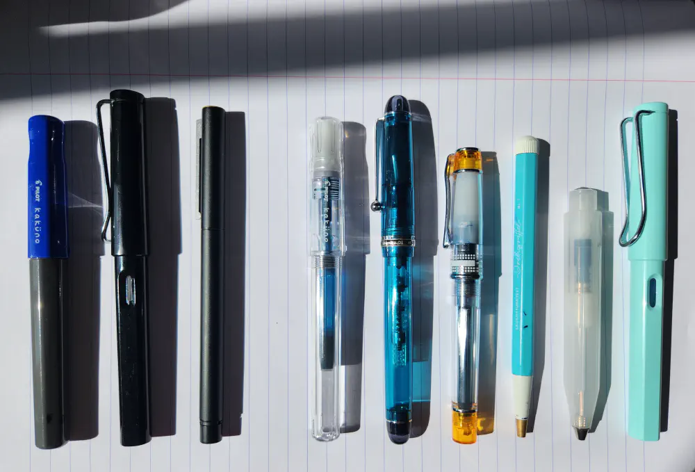
Dark and bright groups. Much nicer.
I even made up some other groupings, like monochrome and coloured, or matching them into pairs so that each pair would look and write well together. Suddenly I felt like a little kid playing with my toys rather than a uni student with writing tools. Fun! And it brought me some peace of mind: my pens look good together after all. They just needed the right framing.
I guess this post is yet another observation that changing your perspective can help you feel better about something. Many of us can think of sad things which we could only make peace with once we found the correct perspective on them; the story of my pen collection is a more lighthearted example.
-
In the following story, the ballpoints weren’t actually on my desk with the others, but I wanted to show them off too. ↩︎